The Square from the Cover
World Wide · 01.04.2008
By Илья Горячев
The giant flywheel of the industry for creating pop icons and underground heroes, set in motion back in the 1970s, has now acquired an unprecedented scope and cosmically boundless possibilities. Today a release is tightly interwoven with other media; often it is dissolved in the stream of information generously spread by resources like MySpace or Beatport. This is somewhat counterbalanced by the release of vinyl records - besides being in extraordinary demand among DJs, they are also a great collector's fetish, whose worthy artwork lets one feel the weight of the work. At the dawn of the music industry one scheme operated: release a record - organize a concert. With the appearance of the compact disc and the easing of many processes in distribution, for a long time the music release was tied to the development of technology.
To this day the release of vinyl records and discs remains a combination of the author's thought, the musician's creative act, and a piece of plastic as the form of its embodiment. The name of the label and the chosen signature style, a social message or simply the latest protest, still remain a hard currency and an indisputable value. Labels have the ability to choose a corresponding face, manner of behaviour, and methods of influencing the listeners' consciousness, which is reflected in the releases they put out. They can put out series of releases, albums, the singles and 12-inches that precede album releases, special editions for collectors, DVD boxes, compilations, and select a corresponding visual series for all of it. A recognizable label design, forming a single conceptual line for a series of releases, becomes the material embodiment of the music and, in a certain sense, the "face" of the artist or project.

What is key for a label and an artist - the individual creative act or the desire to become famous as quickly as possible - is inevitably reflected on the cover carrying its music. Original design is closely linked to the development of independent labels within the arena of intellectual competition and to record sales. Besides, the stance "art for art's sake" is topical now, that is, without bloodthirsty ambitions. Not merely competition with the majors, but a free field for self-expression.
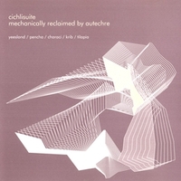
An example of an extreme can be found in Carsten Nicolai's (Carsten Nikolai aka alva noto) label Raster/Noton - a pure, dry concept, inhuman music with an ideal match between the concept and the music itself - empty electronica woven from noises, which suits perfectly the grey squares on a white background on the covers, the transparent vinyl of the records and the futuristic CD packaging reminiscent of vacuum plastic sleeves for microchips. Similar methods are used by M_NUS, somewhat less captivating in its minimalism, yet commendably following the chosen line of design nihilism.
Another example of the strict pursuit of intellectual refinement is Warp - famed for many years for its collaboration with amazing people - The Designers Republic, who besides Warp did the artwork for Novamute, as well as creating an exclusive design for Issey Miyake, drawing the artwork for the game Wipeout, doing a rebranding for Nickelodeon and the project for the British Pavilion at the Venice Biennale. A countless number of the Designers Republic's works are coloured with three-dimensional monochrome abstractions - now iconic for designers - minimalist large fonts and various digital ambiguities. Nowadays Warp, it seems, has grown a little tired of the glitch fever of the '90s and releases ambiguous quasi-experimental music and rock, having ceased to surprise with its covers.

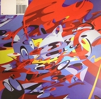
As a trend one can now trace the ubiquitous gradients and the surefire bright, flashy two-dimensional constructions with extensive use of fluorescent fills - on the one hand attracting attention with their psychoactive colours, on the other hand minimalistically detached due to the absence of design frills. The brightest (in every sense) example here is the commissioned design by the Double Standarts studio for Perlon. The design in this case probably serves to concentrate the listener's attention on the content that contradicts the form - dense, reduced music accentuated on skeletal grooves and carefully rendered low frequencies in the absence of other components. Many designers work with bright colours, yet only in rare cases do they look
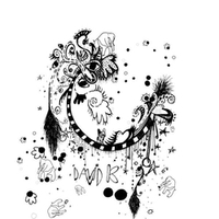
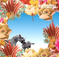
appropriate and beautiful and match the musical component. Extraordinarily successful and entertaining covers are made by Danielle Gluckmann, a gifted girl from Germany who has done the artwork for releases by Crosstown Rebels, Wagon Repair, Horizontal and Vinyl Club (the last is only about to put out three releases with her artwork). Perhaps it was in her collaboration with Horizontal that her eco-erotic style found its true flowering - this label's covers can be placed on shelves and hung on walls like small works of art. Besides, Danielle has created the visuals for performances by such artists as Pier Bucci, Takagi Masakatsu, Chica & The Folder, and in general collaborates in every way with various promising promoters and projects.
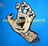
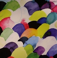
More complete emotional ornaments, brought to ecstatic visual perfection, adorn all the records of Cadenza, whose "family" designer is Luciano's sister - Amelie Nicolet. Her design ideas coincide logically with the artists' ideas - the repetitive multicoloured jungles woven from organic silhouettes and traced flowers are extraordinarily similar to the "blossoming" and changeable sound of the label. The status of a label's personal designer allows artists to realize their ideas calmly and consistently and to hone their craftsmanship, which often leads to new horizons and prospects.
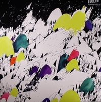
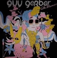
A very eloquent design is created for Guy Gerber's Israeli label Supplement Facts by the young and gifted Ville Savimaa and Emilie Cassiez. Such an international union gives rise to wonderful releases in which the artwork sometimes surpasses in beauty and grace the monotonous, exalted minimalist compositions.
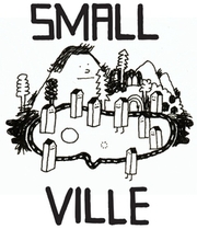
Not infrequently the founders and heads of labels shape their own style, draw the covers, put out the music, while also managing to drop into the studios of their subsidiary musicians and interfere in the recording process of the next masterpiece with their own instructions. A bright and charismatic example is Ata, a veteran DJ and holder of the conglomerate Ongaku - Klang Electronik - Playhouse. Ata very skilfully and consistently decorates the sleeves and covers of the latter with an abundance of gradations of black with hazy inclusions of engravings, spreading utter darkwave, or, on the contrary, arranging explosions of colour and flashy slogans. The slogans often migrate onto T-shirts, accessories and badges that can be bought through the website. Another German wunderkind fitted organically into the general context of Playhouse - Stefan Marx, a talented German graphic artist. With his inimitable ironic style, his dark little cartoons and naive understatement, Stefan has also won the hearts of the skateboarders of The Lousy Living Company and the Hamburg label Smallville, who entrusted him with the creation of their image.
The task of completing a musician's image falls to photography, capable of laying bare, exalting or simply embellishing previously faceless electronic artists. Often photos from booklets move on into galleries, as in the case of the remarkable photo-artist Tina Winkhaus. Her portraits of performers such as Dj Hell, Dinky, Ellen Allien, Chicks on Speed, T.Raumschmiere, Pole and many others live a life of their own; on them the subjects are placed into mystical worlds invented by Tina, revealing themselves from an unexpected (or carefully planned?) angle.
The authors listed are only the tip of the iceberg of contemporary media design. The world is brimming with talents, making it possible to discover new names every day and to lay on visual feasts for the eyes - minimalism or maximalism, sensual ornaments, flirtations with futurism or indestructible punk - all techniques and styles are put to use, limiting the inquisitive designer's mind only by the borders of the graphics tablet or the set of brushes. The means of modern printing, coloured vinyl, multi-page booklets and posters, collector's editions and boxes, together with original accessories and clothing, crown the audiophile's delight like a cherry on a cream cake.